
Liquidation Maps Fundamentals: The Complete Beginner's Guide to Reading LiqMaps
You Are Trading Blind. Here Is Why.
Every single day in crypto futures and perpetual swaps markets, billions of dollars in leveraged positions sit waiting to be closed. Not by choice -- by force. When price hits a trader's liquidation price, the exchange's risk engine automatically closes the entire position. No negotiation. No second chances. Just an algorithmic market order dumping into the book.
Now imagine thousands of these forced closures all happening at the same price level. That is a liquidation cluster -- a zone where concentrated leverage creates a cascade of automatic buying or selling that moves price violently and predictably.
Here is the problem: you cannot see these clusters on a normal chart. Candlesticks show you where price has been. Order books show you current bids and asks (which are often spoofed). Neither one shows you where the actual fuel is sitting.
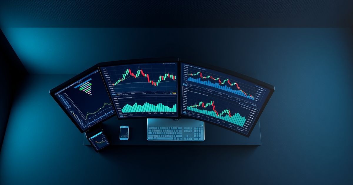
Kingfisher's Liquidation Maps (LiqMaps) are the only tool that visualizes this data. And once you learn to read them, you will never look at a price chart the same way again.
This guide assumes zero prior knowledge. We start from absolute basics and build up to actual trade setups you can use today.
What Is a Liquidation Map? (The Plain English Version)
A liquidation map is a chart that shows every leveraged position's liquidation price across the entire futures market, grouped into clusters at specific price levels.
Think of it like this:
Imagine a room full of people holding buckets of water. Each person has been told: "If someone says the magic number, dump your bucket." Some people have tiny cups. Some have massive barrels. The liquidation map shows you exactly how much water (money) will dump at each possible magic number (price level).
When price reaches a number where lots of people have big buckets? Flood. When it reaches a number with only small cups? Sprinkle.
Your job as a trader is to know where the floods are going to happen and position accordingly.
How to Read a LiqMap: Axis by Axis
The X-Axis (Horizontal) = Price
Simple. Each point along the horizontal axis represents a specific price level. On a $BTC LiqMap covering $90,000-$100,000, the left side shows $90K levels and the right side shows $100K levels. Current price is usually marked with a vertical line or indicator.
The Y-Axis (Vertical) = Relative Cluster Strength
This is where beginners get confused, so pay attention.
The vertical axis does NOT show dollar amounts. It does NOT show number of positions. It shows relative strength using Z-score normalization.
What Z-score means in plain terms: How unusual is this cluster compared to the average cluster?
- A bar reaching up to Z-score 1.0 = slightly above average cluster (mild reaction expected)
- A bar reaching Z-score 2.0 = significantly above average (strong reaction likely)
- A bar reaching Z-score 3.0+ = extremely unusual (explosive move probable)
The key insight: Taller bars = bigger explosions when price hits them. Bar height equals market impact potential, not raw dollar value.
Why Z-Score Instead of Dollar Amounts?
Dollar amounts are misleading for comparison. A $50M cluster at $30,000 BTC is very different from a $50M cluster at $100,000 BTC. At $30K, $50M represents a large portion of the market's total leverage. At $100K, the same $50M might be noise.
Z-score normalizes for this. It tells you: "how significant is THIS cluster compared to all other clusters on this map?" That is the number that actually matters for trading decisions.
Understanding Colors on LiqMaps
This is the #1 misconception among new LiqMap users, so let me be crystal clear:
Colors on liquidation maps distinguish between different clusters. They do NOT indicate direction (bullish/bearish).
If you see a blue cluster next to an orange cluster, that simply means "these are two separate concentration zones." Blue is not bullish. Orange is not bearish. They are just labels.
For directional information, use LiqRatios (available alongside LiqMaps on Kingfisher). LiqRatios show the sum of long versus short liquidations at each price level WITH red/green coloring indicating directional bias:
- Red = net long liquidations at this level (price pushed down by long liquidations)
- Green = net short liquidations at this level (price pushed up by short liquidations)
Beginner tip: Start by looking at LiqMap (the cluster locations) and LiqRatio (the direction) together. Using only one gives you half the picture.
The Different Leverage Views Explained
Kingfisher offers multiple LiqMap views filtered by leverage tier. Each view tells a different story because different types of traders use different leverage levels:
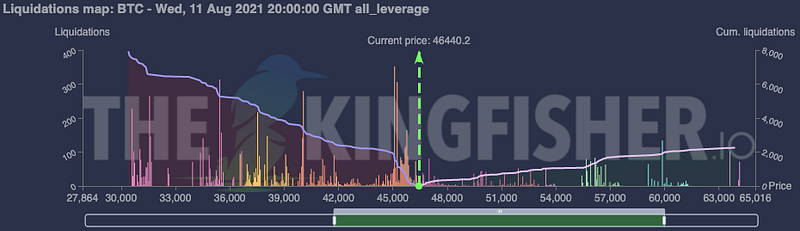
All Leverage View
The complete picture. Every liquidation from 1x leverage degenerates up to 125x maniacs, all combined into one map. This is your default starting point for any analysis.
When to use: General market overview, swing trade planning, identifying the biggest overall clusters.
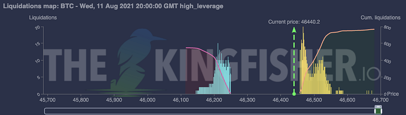
High Leverage View (10x - 125x)
Where the action happens fastest. High-leverage traders have liquidation prices extremely close to current price. Their clusters trigger with tiny price movements but create sharp, violent reactions.
When to use: Scalping, intraday trading, finding micro-clusters within 0.5%-2% of current price. These clusters produce the fastest moves but also the most false signals (high-leverage positions open and close constantly).
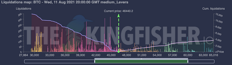
Medium Leverage View (3x - 10x)
The sweet spot for serious retail traders and smaller prop firms. Clusters here are more durable than high-leverage ones because 3x-10x traders tend to hold positions longer. Moves triggered by medium-leverage clusters are more sustained.
When to use: Day trading on 15-minute to 4-hour timeframes. These clusters produce reliable moves that give you time to enter, manage, and exit.
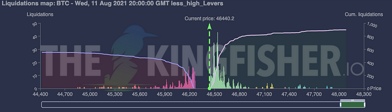
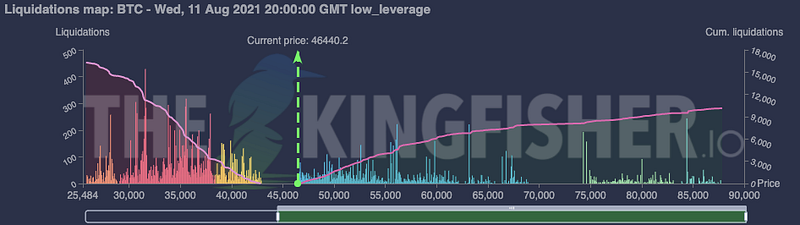
Low Leverage View (1x - 3x)
Institutional territory. Whales, funds, and conservative traders who use minimal leverage. Clusters here are enormous in dollar terms but require significant price movement to reach. When they finally trigger, they drive the major trend-level moves.
When to use: Swing trading, position trading, understanding the "big picture" fuel that will drive price over days or weeks.
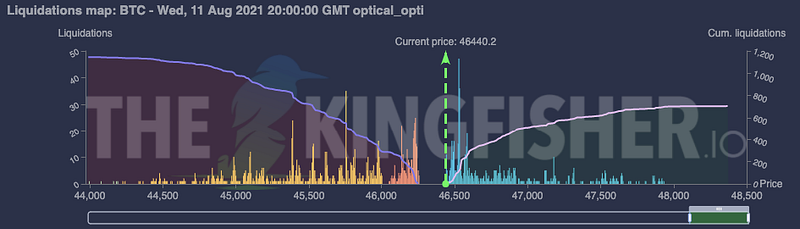
Optical Optimized View
An experimental view that mimics camera auto-focus mechanics. It emphasizes short-term, high-probability clusters while de-emphasizing distant noise. Think of it as the "what matters right now" filter.
When to use: Quick scans before scalping sessions when you need fast answers, not comprehensive analysis.
What Do Clusters Actually Mean for Price?
After watching thousands of liquidation maps over years of trading, three patterns repeat consistently:
Pattern 1: Price Is Attracted to Dense Clusters
This sounds almost too simple, but observe any LiqMap long enough and you will see it happen repeatedly. Price drifts, chops, consolidates -- and then makes a deliberate move toward the nearest large cluster. Market makers know where the fuel is. Algorithms target it. Price follows.
Why: Every liquidation cluster represents potential profit for whoever triggers it. Market makers can see the same cluster data (they have even better access to it). They trade toward clusters because sweeping them generates volume, spread capture, and fee income.
Pattern 2: Not Every Cluster Gets Swept
This is the trap that burns new LiqMap users. You see a massive cluster $5,000 away from current price and assume "price will definitely go there."
It might. It might not. That cluster could sit there untouched for weeks while smaller, closer clusters get swept repeatedly. Distant clusters are like fuel reserves -- valuable if reached, but price needs a reason to travel that far.
Rule of thumb: Trade clusters within reach (defined by recent volatility range). A cluster 2-3 ATRs away is speculative. A cluster within 1 ATR is actionable.
Pattern 3: Swept Clusters Often Mark Local Extremes
When a major cluster finally gets swept, the resulting move frequently marks a local top or bottom. Here is why: the cascade exhausts itself. All the trapped positions that were providing fuel get liquidated. There is nobody left to push price further in that direction. The fuel is spent.
Trading implication: Taking profit AT or just inside a cluster zone is usually smarter than holding through hoping for continuation. Let the next setup find you.
Basic Trade Setups Off Clusters (Ready to Use Today)
Setup 1: The Cluster Bounce (Beginner-Friendly)
Concept: Price approaches a liquidation cluster and bounces off it because the cluster acts as a magnet that got "used up" triggering partial liquidations, leaving support/resistance.
Conditions:
- LiqMap shows a clear cluster within 1-2% of current price
- Price is approaching the cluster (not already at it)
- No larger opposing cluster between price and target
- LiqRatio confirms direction (green for upward bounce, red for downward bounce)
Entry: Limit order 0.1-0.3% before the cluster edge Target: Opposite side of the cluster (bounce through it) OR return to VWAP/midpoint Stop Loss: Beyond the cluster zone (if long cluster below, stop goes under the cluster bottom) Risk/Reward: Minimum 1.5:1
Example: $BTC at $96,500. Long cluster visible at $96,000-$96,200 (Z-score 1.8). Enter long at $96,280. Target: $96,800 (back above entry). Stop: $95,900 (below cluster).
Setup 2: The Cluster Sweep (Intermediate)
Concept: Price has momentum toward a cluster and will likely sweep through it, triggering cascading liquidations.
Conditions:
- Clear cluster 0.5%-1.5% away in momentum direction
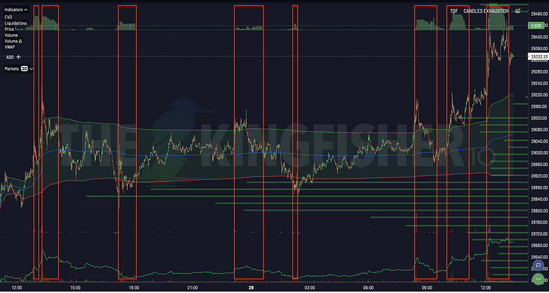
- TOF (Toxic Order Flow) showing informed activity in sweep direction
- CVD confirming buying/selling pressure alignment
- Cluster Z-score > 1.5 (statistically meaningful, not noise)
Entry: With momentum, at current price or slight pullback Target: Inside the cluster zone (take profit as price enters cluster core) Stop: Beyond recent structure (swing low/high), NOT beyond the cluster Risk/Reward: 2:1 or better
Example: $ETH at $3,450. Short cluster at $3,520-$3,560 (Z-score 2.1). ETH showing bullish momentum, TOF spiking green. Enter long at $3,455. Target: $3,540 (cluster edge). Stop: $3,410 (recent higher low).
Setup 3: The Range Fade (Two Clusters Defining Range)
Concept: When clusters exist both above AND below current price, they define a mechanical range. Fade the edges.
Conditions:
- Clear long cluster below price (support zone)
- Clear short cluster above price (resistance zone)
- Price currently between the two clusters
- Clusters are roughly equal in Z-score intensity (balanced range)
Entry Long: Near the lower (long) cluster Entry Short: Near the upper (short) cluster Target: Midpoint between clusters Stop: Outside the respective cluster zone Risk/Reward: 1.5:1 minimum per leg
Common Beginner Mistakes (And How to Avoid Them)
Mistake 1: Trading Every Cluster You See
Not every bar on the LiqMap deserves a position. Filter aggressively:
- Z-score below 1.0? Skip it. Probably noise.
- Cluster further than 2% away on $BTC? Swing territory, not for your current timeframe.
- Only one signal (LiqMap) confirming? Wait for TOF or CVD alignment.
Quality over quantity. Three well-selected cluster trades beat twenty random ones every time.
Mistake 2: Confusing Cluster Direction
Remember: colors on LiqMap do NOT indicate direction. A tall blue cluster is not "bullish." It is just a concentration zone. Use LiqRatio for direction, or cross-reference with CVD and TOF.
I have seen traders go long into massive long clusters (which would dump price if swept) because they thought the color meant something it did not. Do not be that trader.
Mistake 3: Using Stale Maps
Liquidation maps are snapshots. Positions open and close constantly. The map you pulled this morning might be completely irrelevant by this afternoon.
Best practice: Pull a fresh map before every significant trade decision. For active day trading, refresh every 1-2 hours. Premium users get real-time cluster updates.
Mistake 4: Ignoring Timeframe Context
A cluster that looks huge on a 1-hour LiqMap might be invisible on a daily LiqMap (because it formed and dissolved within hours). Match your map timeframe to your trading timeframe:
- Scalpers: Focus on High Leverage view, refresh often
- Day traders: Medium + High Leverage views, refresh every few hours
- Swing traders: All Leverage + Low Leverage views, daily refreshes
Your First 10 Minutes With a LiqMap
Ready to try this yourself? Here is exactly what to do:
Minute 1-2: Go to thekingfisher.io, select $BTC, and generate a liquidation map using "Last." Just look at it. Notice the bars. Notice where current price sits relative to clusters.
Minute 3-4: Identify the 3 tallest clusters. Note their price ranges and approximate Z-scores (taller = higher Z-score).
Minute 5-6: Switch to LiqRatio view. Note which direction each of those 3 clusters leans (red = long liqs dominate, green = short liqs dominate).
Minute 7-8: Ask yourself: "If price wanted to move, which cluster would it hit first?" That is your nearest magnet level.
Minute 9-10: Check TOF and CVD on the same pair. Does flow data support movement toward that nearest cluster? If yes, you have identified your first LiqMap-aware setup.
It really is that simple to start. The depth comes with practice, but the basic mechanic -- seeing where fuel sits and trading accordingly -- is accessible from day one.
Related reading: Once you have mastered LiqMap fundamentals, level up with our complete scalping toolbox guide, understand the origin story in why heatmaps changed everything, or explore CVD strategies for volume confirmation techniques. For the full modern guide with GEX+ and TOF integration, read liquidation maps 2026. To understand how exhaustion candles form at these cluster levels, check our reversal pattern guide. If you are completely new to reading charts, start with how to read crypto charts. Ready to start reading live maps? View Kingfisher pricing or see all features.
Related Articles
- Liquidation Maps 2026: Complete Guide to Crypto Liquidation Heatmaps
- The Kingfisher Scalping Toolbox: Complete Guide to Scalping Crypto Perps
- CVD + LiqMap Trading: Volume Delta Strategies for Liquidation Maps
- How to Read Crypto Charts: The Complete Beginner's Guide
FAQ
Q: I've never looked at a liquidation map before. What am I actually looking at? A: Imagine a map where green zones show where people who are LONG Bitcoin have their liquidation prices clustered, and red zones show where SHORT sellers' liquidations sit. Each zone has a dollar value -- that's how much money in forced buying/selling will happen IF price reaches that level. Current price is somewhere in the middle. Green below you = if price drops, those longs get liquidated (forced selling = price drops MORE). Red above you = if price rises, those shorts get liquidated (forced buying = price rises MORE). You're looking at a map of FUTURE forced transactions. That's it. Everything else (strategies, entries, exits) builds on this one concept.
Q: Why do liquidation clusters form at specific price levels instead of being randomly distributed? A: Human psychology and technical analysis conventions. Round numbers ($65K, $70K, $100K) attract positions. Previous support/resistance levels (where price bounced before) attract stop-losses. Options strike prices (evenly spaced intervals) create natural clustering points. Psychological barriers (all-time highs, previous ATHs) concentrate entries. The result: instead of liquidation prices being evenly distributed, they CLUSTER at these levels because thousands of independent traders all converge on the same "obvious" levels. These clusters are predictable precisely because they're driven by shared human behavior patterns. The LiqMap makes this collective behavior VISIBLE.
Q: How do I read Z-scores and what Z-score threshold makes a cluster "tradeable"? A: Z-score measures how unusual a cluster's size is compared to the average cluster over the lookback period. Z-score of 1.0 = cluster is 1 standard deviation above average size (notable). Z-score of 2.0 = very large cluster (significant, worth planning around). Z-score of 3.0+ = exceptionally large (major inflection point, high-probability catalyst when approached). For beginners: treat Z-score > 1.5 as your minimum filter for "worth noting" clusters. Z-score > 2.5 as "major level that will almost certainly produce a reaction when tested." Below 1.0: noise, ignore for swing purposes (might matter for scalps but don't build weekly theses around it).
Q: What's the LiqRatio view and why does it matter? A: LiqRatio shows the BALANCE of long vs short liquidations at each cluster level, not just the total size. A cluster at $67,000 might show $3B TOTAL liquidations, but LiqRatio reveals whether that's $2.8B longs + $0.2B shorts (heavily long-biased = downward cascade if broken) or $1.5B each (balanced = uncertain direction). This distinction is critical: a long-dominated cluster below price acts as support UNTIL it breaks, then becomes a magnet for further downside (all those longs must sell). A balanced cluster might produce a choppy reaction rather than a clean sweep. Always check LiqRatio after identifying cluster size -- the balance tells you what KIND of move to expect.
Q: What's the realistic timeline for going from "complete beginner" to "comfortably reading LiqMaps for trade decisions"? A: Week 1: Can identify big clusters and understand green/red zone meaning. Can answer "where is the nearest fuel?" accurately. Week 2: Understand Z-score, LiqRatio, and basic cluster-to-trade logic. Start paper trading based on LiqMap readings. Week 3-4: First live trades using LiqMap-informed entries. Making mistakes (trading every cluster, ignoring TOF, wrong timeframe). Month 2: Filter developing. Trading fewer setups but better ones. Win rate noticeably improving. Month 3+: Personal playbook forming. Know which cluster types match your style. Alerts doing heavy lifting. The 10-minute fundamental read described in this guide becomes second nature. Most users report the "aha moment" somewhere in week 2-3 when they realize their last three stop-outs were inside cluster zones they couldn't previously see.
The map does not guarantee treasure. But walking blind guarantees you will never find it.
Transform Your Crypto Strategy
Harness The Power of The Kingfisher's Comprehensive Market Intelligence!
Glossary
Learn key terms and concepts from our comprehensive crypto trading glossary.
Browse Glossary →Related Articles
Toxic Order Flow Bitcoin: Detect Market Manipulation in Real-Time
Stop being exit liquidity. Learn how toxic order flow (TOF) reveals when whales are hunting retail traders. Practical guide with step-by-step interpretation and trading strategies.

Getting Started on The Kingfisher: Stop Being Exit Liquidity
What problem does Kingfisher solve? See how liquidation maps reveal where price will go BEFORE it moves there. Stop getting hunted by whales. Start trading with an edge in 10 minutes.
How to Detect Crypto Market Manipulation in Real-Time
Stop being played by whales. Learn to spot crypto manipulation before it costs you money using Kingfisher's Toxic Order Flow and liquidation data. Real examples included.

Options Skew Templates for Perp Traders: Complete Guide to Using Skew Data on Kingfisher
Master options skew data for perpetual futures trading. Learn how to read and use Skew templates on Kingfisher, understand different template types (Basic, Vanilla, Premium), when each template works best, and how to combine skew analysis with LiqMap confirmation for high-probability crypto trading setups.