

The most useful first session with The Kingfisher is not about finding a trade. It is about learning what the visualization represents, what it leaves out, and how to record an observation without turning it into a prediction.
A liquidation map is a model-based view of potential liquidation concentrations. It does not display every trader's private position, reveal an exchange's complete risk engine, or tell you where price is required to move. The values on screen are estimates produced from the model and the inputs available to it. Treating that distinction seriously is the foundation of a responsible workflow.
This guide explains how to begin. Product screens, supported markets, account access, and plan conditions can change, so the authenticated Kingfisher app is the source of truth for what is available to your account today. The Kingfisher documentation is the appropriate place to confirm current controls and definitions.
Start with the question, not the colors
Before opening a chart, write down one neutral question. Examples include:
- Where does the model currently show larger estimated concentrations relative to nearby price levels?
- How different is the same view when I change the time window or instrument?
- Does a zone remain visible across several observations, or does it change materially?
- What happens to the estimate as price approaches, crosses, or moves away from a zone?
These are research questions. They can be answered with screenshots and notes. By contrast, “Where should I enter?” already assumes the map can make a decision that belongs to the user. Keeping the question descriptive makes it easier to notice when the data contradicts an initial interpretation.
Map and heatmap are related, but not interchangeable
The public Bitcoin liquidation map and Bitcoin liquidation heatmap explain two complementary views.
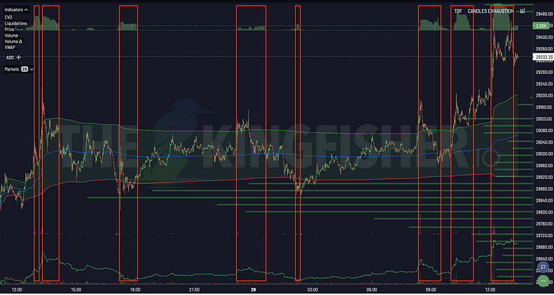
A map is useful when you want to inspect estimated concentrations by price level at a particular observation time. Relative bar size or intensity helps compare zones inside that specific view. It should not automatically be read as currency value, certainty, or the size of a future market move.
A heatmap adds a time dimension. It helps show how modeled zones appeared, persisted, shifted, or faded over the displayed interval. A bright historical band is evidence that the model displayed intensity there during that period. It is not proof that the zone caused later price action.
When first learning the product, use one view at a time. Describe what you can see before combining it with another panel. This avoids a common beginner problem: collecting several indicators until one of them appears to support the desired conclusion.
A five-part reading of any visualization
Every Kingfisher view should be read through five basic questions.
1. Which instrument is selected?
Confirm the symbol, contract, and venue context shown by the interface. Similar tickers can refer to instruments with different collateral, settlement, or price conventions. If the interface offers an aggregate, do not assume it is equivalent to a single venue.
2. What time does the observation represent?
Record the time visible in the interface and your own observation time, including the time zone. A screenshot without a timestamp is hard to compare later. Do not infer update frequency from how often pixels change in the browser; consult the current product documentation for the meaning of the displayed timestamps.
3. What are the axes and units?
The horizontal and vertical axes, color scale, and normalization determine what a shape means. Relative intensity is not necessarily a dollar amount. A value normalized within one view may not be directly comparable with another asset or time range. If a unit is unclear, pause and check the documentation rather than filling the gap with an assumption.
4. What is modeled rather than directly observed?
Liquidation maps estimate where leveraged positions may face forced closure under model assumptions. Actual liquidation depends on details such as the exchange's mark-price process, margin rules, maintenance requirements, position changes, and available liquidity. Those details can vary and may not all be observable from public market data.
5. What would invalidate your interpretation?
Write down a disconfirming observation. For example: the zone disappears on the next view; the instrument selection was wrong; the scale changed; price crosses the area without a visible change in traded activity; or the supposed relationship fails repeatedly in later samples. An interpretation that cannot be challenged is not a useful research hypothesis.
Your first structured session
Step 1: confirm access and definitions
Open the authenticated app and note which screens, instruments, and controls your account displays. Do not rely on an old article, screenshot, social post, or third-party review to infer current coverage or entitlements. If a label is unfamiliar, consult the documentation before interpreting it.
Step 2: choose one liquid instrument
For learning purposes, one instrument is enough. Repeatedly changing assets makes it difficult to tell whether a visual difference comes from the market, the model scale, or the selected contract. Verify the exact ticker and keep it fixed for the first comparison.
Step 3: capture a baseline
Record:
- instrument and contract label;
- venue or aggregate context shown;
- chart time range;
- observation time and time zone;
- visible price reference;
- the two or three most visually prominent estimated zones;
- any uncertainty about units or controls.
Use neutral language such as “the model displays a larger band above the current reference price than immediately below it.” Avoid “price is targeting the upper band.” The first sentence is an observation; the second adds an unsupported causal story.
Step 4: wait, then compare like with like
Return later with the same instrument and comparable settings. Ask what changed. Did intensity increase, decrease, move, or remain broadly similar? Did the scale auto-adjust? Has the reference price changed enough to alter the visible range? A valid comparison holds these presentation choices as constant as the interface permits.
Step 5: review the outcome without rewriting the hypothesis
Once the observation window ends, document what happened, including uneventful cases. Do not keep only screenshots where price later interacted with a visually prominent zone. That creates selection bias and can make a weak relationship look persuasive.
Use an observation card
A compact observation card makes later review more reliable:
| Field | What to record |
|---|---|
| Context | Instrument, contract, venue context, time range |
| Source time | Timestamp and time zone shown or documented |
| Observation | Literal description of visible modeled zones |
| Interpretation | A tentative explanation, clearly labeled as such |
| Alternative | At least one other plausible explanation |
| Limitation | Missing unit, scale change, coverage uncertainty, or stale view |
| Outcome | What occurred during a pre-defined review window |
| Review | What evidence supported or weakened the interpretation |
This structure separates three things that are often blurred together: what the product displayed, what you thought it might mean, and what the market later did. The separation matters more than the conclusion of any single example.
Add liquidation-price arithmetic carefully
The crypto calculators can help explore simplified leverage and liquidation scenarios. They are educational models, not a substitute for the liquidation price and margin information displayed by your exchange account.
An exchange can use mark price, maintenance-margin tiers, fees, funding, collateral rules, cross-margin balances, or other adjustments that a simplified calculator does not reproduce. Before relying on any scenario, compare its assumptions with the official rules for the exact contract. For an open position, the exchange account remains the operational source of truth.
The useful question is not “Is there one exact liquidation level for every trader?” It is “How sensitive is this simplified scenario to leverage, collateral, direction, and maintenance assumptions?” Sensitivity analysis teaches more than treating a single output as exact.
Common interpretation errors
Reading intensity as probability
A larger modeled concentration is not a probability that price reaches the area. The chart does not encode every force that can move the market, and it does not assign a verified outcome likelihood to a zone.
Treating a zone as a precise line
Displayed levels depend on model resolution, price increments, normalization, and the selected range. A band is usually better discussed as an area in the visualization than as an exact market instruction.
Assuming causation after a touch
If price later crosses a displayed zone, the sequence alone does not establish why the move happened. News, broader positioning, order-book conditions, or unrelated flows may contribute. A screenshot can document chronology, not causal proof.
Comparing two screenshots with different scales
Auto-scaling can make a moderate zone look visually similar to an extreme one in another panel. Check the legend and settings before comparing magnitude across views.
Ignoring missing and revised data
Every data product has boundaries. Feeds can be delayed, interrupted, corrected, or unavailable, and instrument coverage can differ. Absence of a visible zone does not prove absence of leveraged exposure.
Turning the map into a complete strategy
A visualization does not know your objectives, financial situation, position size, exchange rules, or tolerance for loss. It should not replace independent research or risk controls. This article is educational and is not financial advice.
A better learning objective
Do not judge your first week by whether a hypothetical position would have made money. Judge it by whether your notes became more precise.
Good progress looks like this:
- you consistently record the correct instrument and timestamp;
- you distinguish normalized intensity from currency value;
- you can explain the difference between a map and a heatmap;
- you label assumptions and alternatives;
- you retain failed and ambiguous observations;
- you check current product definitions instead of relying on memory;
- you can state why the model output is not a price forecast.
After a meaningful sample of observations, review them as a group. Look for stable relationships, counterexamples, and changes caused by settings. Do not infer a robust pattern from a handful of memorable charts.
Where to go next
Read the complete liquidation-map guide for terminology and interpretation principles. Use the Bitcoin liquidation map to study a point-in-time representation, then compare it with the Bitcoin liquidation heatmap to understand persistence through time. The history page documents The Kingfisher's public chronology and source material. For current product controls, access, supported instruments, and account conditions, use the authenticated app and documentation.
FAQ
Does a liquidation map show actual exchange positions?
It should be read as model output estimating potential concentrations, not as a ledger of every private account. The model depends on its inputs and assumptions, while actual positions and exchange risk parameters can change.
Does the largest zone identify the next destination for price?
No. Relative visual intensity describes the modeled view. It does not establish direction, timing, probability, or causation.
How often should I refresh the view?
Use the timestamps and definitions documented in the current product rather than a fixed rule from an article. For research, choose observation intervals in advance and keep them consistent enough to make comparisons meaningful.
Which markets and features are included with my account?
Check the authenticated app. Coverage, screens, and account conditions are product facts that can change and should not be inferred from this guide.
Can I use a calculator result as my exchange liquidation price?
No. A calculator illustrates a simplified scenario. Your exchange's current account and contract rules determine its operational figure.
Is this a trading signal?
No. The workflow is designed for careful observation and documentation. It does not recommend a transaction or promise an outcome.