What is a Bitcoin liquidation heatmap?
A liquidation heatmap plots relative liquidation pressure on two axes: price vertically and time horizontally.


Heatmap · SUI / USDT
Sui (SUI) Real-Time Liquidation Clusters
Follow liquidation pressure across price and time as the market builds, moves and clears leveraged positions.
Price × Time
The Kingfisher Heatmap turns successive LiqMap readings into a continuous view. Color intensity makes the strongest zones and their evolution visible at a glance.
A liquidation heatmap plots relative liquidation pressure on two axes: price vertically and time horizontally.
Start from the live price, compare the brightest bands above and below it, then follow each band across time to see whether pressure is building or fading.
Bright, persistent bands reveal where liquidation pressure is concentrated. Bands that fade or disappear show where that pressure has weakened or cleared.
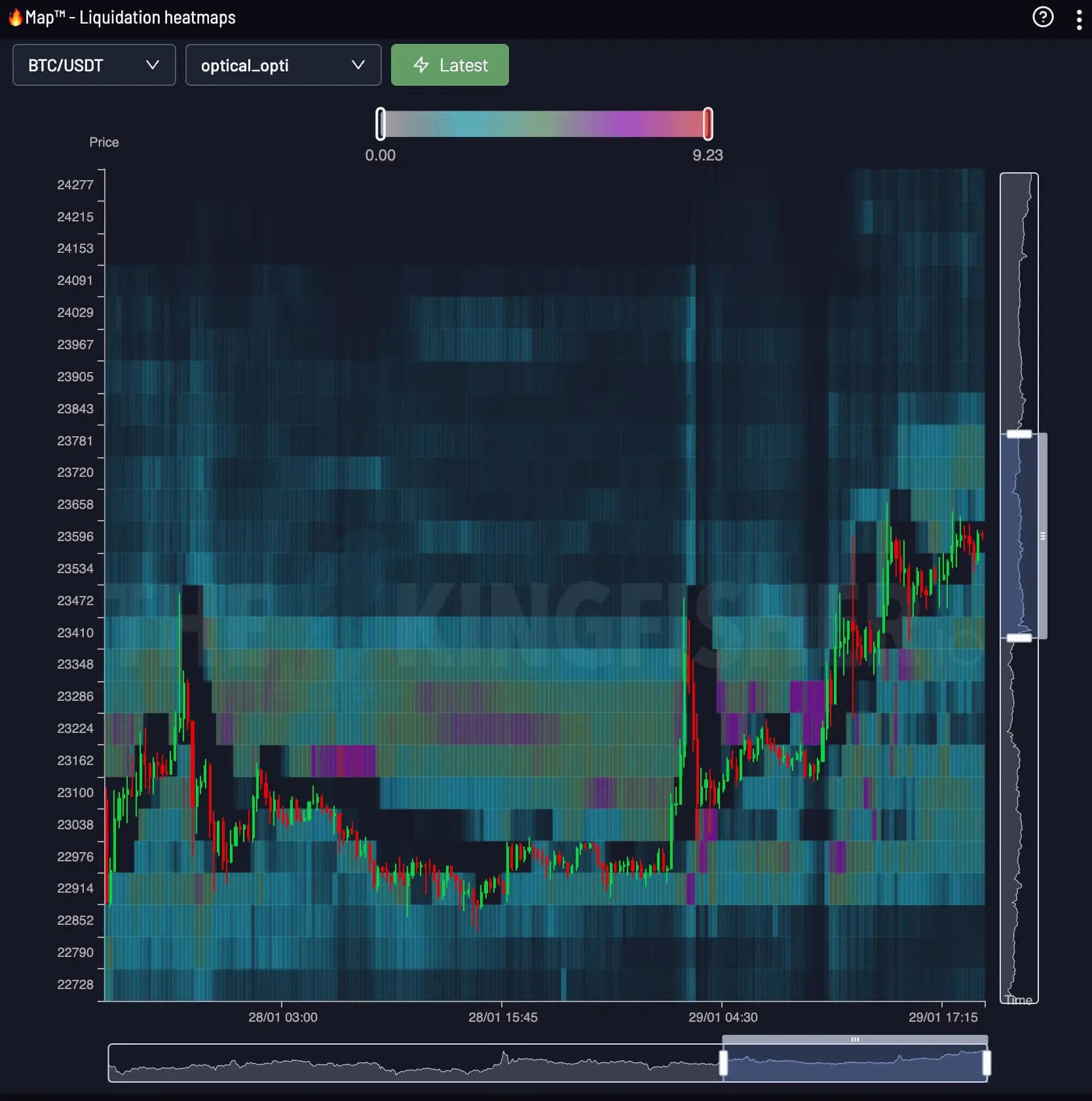
LiqMap / Heatmap
LiqMap shows the liquidation structure around price at one point in time. Heatmap adds the time axis so you can follow where that structure builds, moves and clears.
Sui Liquidation MapThe Kingfisher Terminal
Open the live Heatmap in The Kingfisher terminal. Snapshot and Footprint views are included with Premium access.
FAQ
Everything you need to know about Bitcoin liquidation heatmaps
A liquidation heatmap plots relative liquidation pressure on two axes: price vertically and time horizontally.
Start from the live price, compare the brightest bands above and below it, then follow each band across time to see whether pressure is building or fading.
Open the live Heatmap in The Kingfisher terminal. Snapshot and Footprint views are included with Premium access.
Bright, persistent bands reveal where liquidation pressure is concentrated. Bands that fade or disappear show where that pressure has weakened or cleared.