
Why Liquidation Heatmaps Changed Everything: The Origin Story of LiqMap
Every Trader Has That One Moment
You know the feeling. You short $BTC at what looks like perfect resistance. Clean double top. RSI overbought. Volume drying up. Every signal says "this is it."
Then price punches through your stop loss by $12, rips another $2,000 higher in eleven minutes, and you're left staring at a closed position wondering what just happened.
Here is what happened: you were the fuel. Your stop loss sat inside a liquidation cluster that market makers had been building for hours. When price touched that zone, every stop loss in that cluster triggered simultaneously, creating a cascade that propelled price exactly where you did not want it to go.
This used to be invisible. Traders guessed at support and resistance based on price action alone, completely blind to where the actual leverage was concentrated. Then everything changed.
How It All Started: Building the First Liquidation Heatmap
The idea behind what became Kingfisher's LiqMap was born from frustration -- pure and simple. Watching the same pattern repeat across hundreds of trades: price would gravitate toward specific levels, explode through them with violent momentum, then reverse just as violently at another level that had nothing to do with traditional technical analysis.
These were not random moves. These were liquidation clusters acting as price magnets.
The problem was that no tool existed to visualize them. Exchange data showed individual liquidations in raw feeds, but nobody was aggregating this data into a readable format that traders could actually use. So we built it.
The first version of the Kingfisher liquidation heatmap pulled data from major perpetual futures exchanges (Binance, Bybit, OKX, and others) and rendered every liquidation price point as a visual cluster on a single chart. The result looked like nothing else in crypto trading -- bars of varying height representing the relative strength of liquidation concentrations at each price level.
Traders who saw it for the first time had the same reaction: "I finally understand why my stops keep getting hit."
What Exactly Is a Liquidation Heatmap?
A liquidation heatmap (or LiqMap, as the Kingfisher community calls it) is a visualization tool that shows you exactly where leveraged positions will be force-closed across the entire futures market.
Here is how it works under the hood:
Data Aggregation: Kingfisher pulls real-time position data from every major derivatives exchange. Each open leveraged position has a liquidation price -- the price at which the exchange's risk engine automatically closes the position to prevent further losses.
Cluster Detection: Individual liquidation prices are meaningless on their own. But when thousands of positions share similar liquidation prices, they form clusters. These clusters are zones of concentrated pain -- areas where a cascade of forced selling or buying will occur if price reaches them.
Z-Score Normalization: This is where Kingfisher's approach differs from raw dollar-value displays. Instead of showing absolute dollar amounts (which can be misleading because a $50M cluster means different things at different price levels), LiqMaps use Z-score normalization. Z-score measures how many standard deviations a cluster is from the mean cluster size. This gives you a standardized, objective way to compare clusters across different price ranges and different assets.

Visual Rendering: Clusters are displayed as vertical bars on a price axis. Taller bars mean stronger clusters. Different colors help distinguish between separate cluster zones (not direction -- colors are for identification, not bullish/bearish signals).
The output is something like X-ray vision into the market's leverage structure. You can see exactly where the fuel is sitting, waiting to be ignited.
Why LiqMaps Beat Guessing Support and Resistance
Traditional support and resistance trading has a fundamental flaw: it only looks at where price has been. Pivot points, Fibonacci retracements, previous highs and lows -- all of these are backward-looking indicators that tell you nothing about where price needs to go next.
Liquidation clusters are forward-looking. They represent actual committed capital that must react when price arrives. This is not theoretical support. This is mechanical, algorithmic, unavoidable market impact.
Consider the difference:
| Approach | Data Source | Reliability | Predictive Power |
|---|---|---|---|
| Price Action S&R | Historical candles | Moderate | Low -- breaks constantly |
| Order Book Depth | Current bids/asks | Low -- spoofed heavily | Very Low |
| Volume Profile | Past traded volume | Good | Medium -- static |
| Liquidation Map | Live leverage data | Very High | High -- mechanical triggers |
When price approaches a major liquidation cluster, one of two things happens:
- The cluster gets swept. All those positions liquidate, creating explosive momentum in the sweep direction. If it is a long cluster below price, the forced selling accelerates the drop. If it is a short cluster above price, the forced buying rockets price higher.
- Price rejects at the cluster. Sometimes the cluster is so large that market participants see it coming and position ahead of it, causing price to reverse before the cascade fully triggers. Either way, the cluster dictated the outcome.
You do not need to guess which scenario plays out. You just need to know the cluster is there.
Real Examples of Cluster Sweeps That Made (and Lost) Fortunes
Example 1: The $40K BTC Long Cluster Sweep (May 2021)
During the May 2021 correction, a massive long liquidation cluster built up around the $40,000 level on $BTC. As price ground lower from $58K, traders kept adding longs, convinced the dip was a buying opportunity. Each new long added more fuel to the $40K cluster.
When price finally touched $40K, the cascade was biblical. Estimates suggest over $3 billion in long positions liquidated within a 4-hour window. Price did not bounce at $40K -- it punched through because the selling pressure from liquidations overwhelmed any remaining buy orders.
Traders who saw this cluster on LiqMap ahead of time either stayed flat or positioned short. Everyone else became part of the fuel.
Example 2: The $28K Short Squeeze Setup (January 2023)
Fast forward to early 2023. $BTC had been grinding sideways between $16,500 and $17,500 for weeks. A significant short liquidation cluster built up around $18,200-$18,500 as bears grew confident that the range would hold.
LiqMap users watched this cluster grow taller day after day. Short interest kept piling in above the range high. The fuel on the shelf was unmistakable.
When $BTC finally broke $17,500 with volume, it did not stop at $18,000. It ripped straight through the $18,200-$18,500 short cluster, squeezing every last short position in a move that took price to $23,000 within three weeks. The cluster sweep provided the initial thrust.
Example 3: The ETH Range Play ($2,200-$2,400 Zone)
$ETH spent much of late 2023 oscillating between $2,200 and $2,400. LiqMap revealed something interesting: large long clusters sat just below $2,200, while equally large short clusters stacked up around $2,380-$2,420.
This created a mechanical range defined entirely by liquidation dynamics, not by arbitrary price levels. Traders who recognized this bought dips toward the long cluster (knowing it acted as a magnet downside but also as support if held) and sold rips toward the short cluster. The range persisted for six weeks because both clusters kept replenishing as new traders entered positions at the extremes.
Example 4: Micro-Cluster Scalping on Alt Perps
Liquidation heatmaps are not just for swing trading $BTC. On altcoin perps with thinner liquidity, micro-clusters create reliable scalping opportunities throughout the trading session.
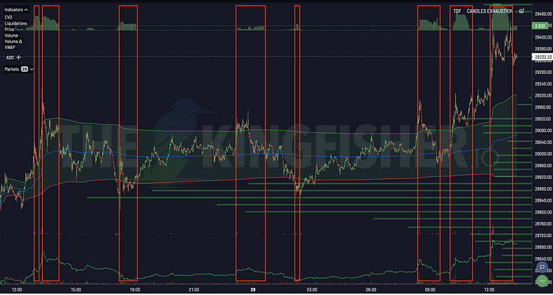
Take a mid-cap alt perp trading at $2.40. LiqMap shows a small-but-dense short cluster at $2.48 and a long cluster at $2.32. A scalper sees price approaching $2.48, notices TOF (Toxic Order Flow) spiking as informed traders position for the sweep, and enters long with a target of the cluster and a tight stop below $2.45. Nine times out of ten, price touches the cluster, triggers the micro-sweep, and the scalp hits target within minutes.
These setups happen dozens of times per day across hundreds of perp pairs. Without a liquidation heatmap, they are invisible.
How to Read a LiqMap: The Complete Breakdown
Understanding the Axes
X-Axis (Horizontal): Price levels. Simple enough. Each point on the x-axis represents a specific price where liquidations are clustered.
Y-Axis (Vertical): Relative strength of the liquidation cluster. This is not raw dollar value. It is Z-score normalized intensity. A bar that reaches twice as high as its neighbor represents a cluster roughly twice as impactful when triggered.
Color Coding
Colors on Kingfisher LiqMaps serve one purpose: distinguishing separate clusters from each other. A blue cluster next to an orange cluster are simply two different concentration zones. Colors do NOT indicate bullish or bearish direction.
For directional intelligence, you want LiqRatios (available alongside LiqMaps), which show the sum of long versus short liquidations at each price level with red/green coloring indicating directional bias.
Leverage Tier Maps
Kingfisher offers multiple LiqMap views filtered by leverage tier, and each tells a different story:
- All Leverage: The complete picture. Every liquidation at every leverage level combined.
- High Leverage (10x-125x): Where the degenerate money lives. These clusters trigger fastest and create the sharpest, shortest-duration moves. Great for scalping.
- Medium Leverage (3x-10x): The sweet spot for day trading. Clusters here are more durable and tend to produce sustained moves rather than instant spikes.
- Low Leverage (1x-3x): Institutional and conservative trader territory. Clusters here are enormous but require significant price movement to reach. These drive the big trend-level moves.
Pro tip: Compare the High Leverage map against the All Leverage map. If a cluster appears on both, it is validated across trader types and extremely likely to produce a meaningful reaction. If a cluster shows on High Leverage but not on Medium/Low, it might be retail noise that gets absorbed before triggering a full cascade.
Timeframe Considerations
Liquidation maps are snapshots in time. The clusters you see right now reflect current open positions. Positions open and close constantly, which means clusters grow, shrink, shift, and disappear.
For day trading, pull fresh maps every 1-2 hours or before any significant trade entry. For swing trading, daily maps give you the weekly picture. For scalping, real-time cluster monitoring (available to premium users) shows clusters forming and dissolving in live sessions.

The Three Truths About Liquidation Clusters
After years of watching these maps and trading off them, three patterns have proven themselves repeatedly:
Truth 1: Price Is Magnetically Attracted to Dense Clusters
It sounds almost supernatural, but watch any LiqMap long enough and you will see it happen. Price drifts, consolidates, chops -- and then suddenly makes a beeline for the nearest large cluster. Market makers know where the fuel is. They trade toward it. Price follows.
Truth 2: Not Every Cluster Gets Swept
This is the trap that catches newcomers. You see a massive cluster $5,000 away from current price and assume "price will definitely go there." Maybe it will. Maybe it won't. That cluster might sit untouched for weeks while smaller, closer clusters get swept repeatedly. Trade the clusters within reach, not the ones in fantasy land.
Truth 3: Cluster Sweeps Mark Local Extremes
When a major cluster finally gets swept, the resulting move often marks a local top or bottom. The cascade exhausts itself. The trapped positions are gone. The fuel is spent. This is why taking profit AT or slightly beyond a cluster target is usually smarter than holding through hoping for more.
Combining LiqMap With Other Kingfisher Tools
A liquidation heatmap alone is powerful. Combined with the rest of the Kingfisher toolkit, it becomes a complete trading system:
LiqMap + Toxic Order Flow (TOF): LiqMap shows WHERE the fuel is. TOF shows WHEN smart money is positioning to ignite it. When TOF spikes as price approaches a cluster, the probability of a sweep goes through the roof.
LiqMap + CVD (Cumulative Volume Delta): CVD reveals whether buying or selling pressure is genuinely absorbing or merely transitory. A cluster approach with diverging CVD often produces a fake-out -- price touches the cluster but CVD shows no real participation, and it reverses.
LiqMap + Funding & OI: Funding rate tells you which side is paying to hold their positions. Open Interest shows whether new money is entering or leaving. A cluster approach with extreme funding AND rising OI on the trapped side? That is maximum-pain territory.
LiqMap + GEX+ (Gamma Exposure): For $BTC and $ETH specifically, options gamma exposure adds another layer. Negative GEX near a liquidation cluster amplifies the volatility. Positive GEX near a cluster can suppress the move temporarily before it eventually breaks through.
Getting Started With Your First LiqMap
Ready to see what the market actually looks like when you can see the leverage?
- Head to thekingfisher.io and pull up any major perp pair
- Generate a liquidation map using the "Last" button
- Identify the 3 largest clusters above and below current price
- Note the distance to each cluster and estimate the Z-score intensity
- Cross-reference with TOF and CVD on the same chart
- Plan your next trade around the nearest cluster, not around some random Fibonacci level
The first time you see a cluster you identified get swept in real-time, something clicks. You stop guessing where price might go and start knowing where it needs to go. That is the difference between trading blind and trading with an edge.
Related reading: Dive deeper into liquidation map fundamentals for a beginner-friendly walkthrough, check out our Toxic Order Flow guide for timing cluster entries, or explore CVD trading strategies for volume confirmation techniques. For the modern all-in-one guide, read liquidation maps 2026. Ready to see it in action? Explore Kingfisher features or view pricing plans.
Related Articles
- Liquidation Maps: The Complete Guide to Reading Cluster Data
- Liquidation Calculator: Know Your Liq Price Before You Get Rekt
- How to Stop Getting Liquidated Before Major Moves
- Weekly Liquidation Hunt: BTC & ETH Analysis
The market does not have to be a mystery. The fuel is on the shelf. All you need is the right map to find it.
FAQ
Q: How often should I refresh my liquidation heatmap during an active trading session? A: For day trading, pull fresh maps every 1-2 hours or before any significant trade entry. Clusters grow, shrink, and shift as positions open and close -- a cluster that looked formidable at market open might be half its size by afternoon if traders took profits or got stopped out. Swing traders can get away with daily maps, but scalpers watching micro-clusters on alt perps should monitor in real-time (available with Elite subscription).
Q: What does Z-score normalization actually mean for my trading decisions? A: Z-score tells you how unusual a cluster is compared to the average. A cluster at Z-score 2.0 means it is 2 standard deviations larger than the mean cluster size -- statistically significant and likely to produce a meaningful reaction when swept. A cluster at Z-score 0.5 is barely above average and may get absorbed without much price impact. Focus your trades on clusters with Z-scores of 1.5 or higher for the best risk-to-reward setups.
Q: Can LiqMaps predict the direction of the next move, or only where clusters exist? A: LiqMaps show WHERE the fuel sits, not which direction price will take. Direction comes from combining LiqMap data with other signals: TOF timing, CVD flow direction, funding rate bias, and GEX+ gamma regime. The cluster tells you the target; the other tools tell you whether price is likely to reach it from above or below. Never trade a cluster in isolation without at least one confirming signal.
Q: Why do some clusters never get swept even though they look huge? A: Three common reasons. First, the cluster might be too far from current price -- price gravitates toward nearby clusters first, and distant ones can sit untouched for weeks. Second, the cluster composition matters: low-leverage clusters (1x-3x) require massive price moves to trigger and often act as support/resistance rather than cascade zones. Third, market participants see large clusters coming and position ahead of them, causing price to reverse before the sweep completes. Trade clusters within realistic reach, not fantasy levels.
Q: How does Kingfisher's LiqMap compare to free liquidation heatmaps on sites like Coinglass? A: Coinglass shows basic heatmaps that are often delayed by 15-30 minutes and aggregate data without Z-score normalization or leverage-tier filtering. Kingfisher provides sub-second real-time updates, Z-score normalized clustering, separate views for high/medium/low leverage tiers, and direct integration with TOF, CVD, and GEX+ on the same chart. The difference is visible the first time you watch a cluster sweep in real-time on both platforms side by side -- Coinglass will still be showing stale data while Kingfisher has already captured the cascade.
Transform Your Crypto Strategy
Harness The Power of The Kingfisher's Comprehensive Market Intelligence!
Glossary
Learn key terms and concepts from our comprehensive crypto trading glossary.
Browse Glossary →Related Articles

Options Skew Templates for Perp Traders: Complete Guide to Using Skew Data on Kingfisher
Master options skew data for perpetual futures trading. Learn how to read and use Skew templates on Kingfisher, understand different template types (Basic, Vanilla, Premium), when each template works best, and how to combine skew analysis with LiqMap confirmation for high-probability crypto trading setups.
Toxic Order Flow Bitcoin: Detect Market Manipulation in Real-Time
Stop being exit liquidity. Learn how toxic order flow (TOF) reveals when whales are hunting retail traders. Practical guide with step-by-step interpretation and trading strategies.
How to Detect Crypto Market Manipulation in Real-Time
Stop being played by whales. Learn to spot crypto manipulation before it costs you money using Kingfisher's Toxic Order Flow and liquidation data. Real examples included.

Getting Started on The Kingfisher: Stop Being Exit Liquidity
What problem does Kingfisher solve? See how liquidation maps reveal where price will go BEFORE it moves there. Stop getting hunted by whales. Start trading with an edge in 10 minutes.