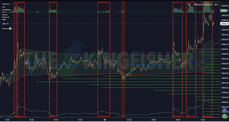


A crypto liquidation map visualizes estimated price zones where leveraged positions may face forced closure. It helps a reader see how liquidation risk is distributed above and below the current market price. The zones are model estimates, not disclosed orders, fixed targets, or guarantees about the market's next move.
This guide explains the mechanics behind liquidation maps, how a map differs from a heatmap, what clusters can and cannot tell you, and how to include the data in a risk-aware research process.
What Is a Liquidation?
A leveraged derivatives position uses collateral to control a larger exposure. If losses reduce the available margin beyond an exchange's maintenance requirement, the exchange can close some or all of the position through its liquidation process.
The direction of that forced closure depends on the position:
- Closing a liquidated long position generally creates sell-side flow.
- Closing a liquidated short position generally creates buy-side flow.
The market effect is not predetermined. Available liquidity, volatility, the number of positions involved, exchange rules, and other market activity all influence what happens during and after a liquidation event.
What Does a Liquidation Map Show?
A liquidation map organizes modelled liquidation exposure by price zone. Depending on the selected product view, its visible scope may cover several venues, instruments, leverage views, or time windows.
The main elements are:
- Reference price: the current or selected market price used to orient the chart.
- Estimated liquidation zones: areas where the model identifies a concentration of possible forced closures.
- Relative cluster strength: a way to compare concentrations within the selected view.
- Direction or side: labels that distinguish estimated long liquidations from estimated short liquidations when the view provides that information.
- Scope and filters: the asset, exchange coverage, timeframe, and other settings behind the display.
Colors and bar shapes are not universal standards. Always read the legend for the specific chart rather than assuming that a color has the same meaning across products.
What the map does not show
A liquidation map is not an exchange account ledger. It does not reveal every trader's position, and a displayed cluster is not a resting order in an order book. Traders can close positions, add collateral, reduce leverage, or move exposure before a zone is reached. Cross-margin rules and exchange-specific liquidation engines add further uncertainty.
For these reasons, a cluster is best understood as a conditional risk zone: a place where forced flows may become more relevant if market price reaches it while the estimated exposure remains present.
Liquidation Map vs. Liquidation Heatmap
The terms are sometimes used interchangeably, but the two views answer different questions.
| Liquidation map | Liquidation heatmap | |
|---|---|---|
| Primary focus | Distribution of estimated liquidation levels in a selected view | Evolution and relative intensity of estimated clusters across price and time |
| Typical visual | Bars, profiles, or distinct cluster zones | A color-intensity layer plotted over a time axis |
| Useful question | Where is estimated liquidation exposure concentrated now? | How have estimated concentrations formed, moved, or faded? |
| Main caution | A snapshot can become stale as positioning changes | Strong color represents modelled intensity, not a certain event |
The Bitcoin Liquidation Map is the dedicated product page for the map view. The Bitcoin Liquidation Heatmap explains the time-based heatmap view. This article remains the educational guide for understanding both concepts.
How to Read a Crypto Liquidation Map
1. Confirm the chart's scope
Start with the asset, contract type, displayed venue scope, timeframe, and visible settings. Two maps can look different because their views or filters differ, even when they refer to the same asset.
Also check the data timestamp. A screenshot from an earlier session describes an earlier estimate; it does not describe current positioning.
2. Locate the reference price
Find the marker for the current or selected market price. Clusters above and below that marker represent different conditional paths. Their presence alone does not establish which side market price will visit first.
3. Read the legend before the colors
Use the product legend to identify long and short liquidation estimates, cluster boundaries, and scale. Some views use color for direction, while others use it only to separate clusters or indicate relative intensity.
4. Compare relative concentration
Look for zones that stand out from neighboring estimates within the same chart and settings. A larger or more intense cluster generally represents a greater modelled concentration relative to that view.
Avoid treating visual size as a cash value unless the current interface explicitly labels it that way. The intensity scale is a product-defined way to compare model output within the active view; it is not an account balance, probability, or promise of market impact.
5. Watch how the estimate changes
A cluster can grow, fade, or move as market conditions and the model output change. Comparing consistent views over time can be more informative than relying on one frame. If the filters change between observations, the comparison is no longer like-for-like.
6. Add independent market context
Liquidation estimates describe one part of derivatives risk. Open interest can help frame how much derivatives exposure remains outstanding; see Open Interest Explained. Funding provides a separate view of the cost and imbalance of perpetual positions; see the Funding Rate Guide.
Neither confirms a liquidation cluster by itself. Price behavior, traded liquidity, volatility, and the reliability of the underlying feed remain relevant context.
How to Interpret a Cluster Without Overstating It
When price approaches an estimated cluster, several outcomes remain possible:
- Positions may be reduced or collateralized before liquidation.
- Some liquidations may occur while available liquidity absorbs the flow.
- Forced closures may coincide with higher volatility or continuation.
- Broader market flow may dominate the liquidation activity.
- The estimate may change as market conditions, data availability, or the selected product view changes.
This is why a cluster should not automatically be labelled support, resistance, a target, or an entry signal. It identifies a concentration of estimated leverage risk. The surrounding market determines how that risk is expressed.
A neutral reading example
Suppose a map shows one prominent cluster above the reference price and several smaller clusters below it. A sound observation is: estimated liquidation exposure is more concentrated in the upper zone in this selected view.
That observation does not establish direction or timing. A researcher can then check whether the estimate persists, whether open interest is changing, how liquid the market is, and whether the same pattern appears under comparable filters.
A Risk-Aware Workflow
A liquidation map can support research without becoming a standalone decision engine. The following workflow keeps observations separate from assumptions:
- Define the question. Decide whether you are reviewing nearby leverage concentration, monitoring a position's risk, or studying a past move.
- Record the scope. Note the asset, venue coverage, filters, and timestamp so the observation can be reproduced.
- Describe the map neutrally. Identify relative cluster locations and strength without assigning a market outcome.
- List uncertainties. Include data freshness, the model-based nature of the output, changing positions, and exchange mechanics.
- Check independent context. Review price behavior, liquidity, volatility, open interest, and funding separately.
- Apply predefined controls. If the research informs a live position, exposure limits and exit conditions should be set independently of the map.
- Review afterward. Compare the estimate with what occurred and note whether the cluster persisted, changed, or disappeared.
This structure also makes historical analysis more useful: it prevents a later outcome from changing how an earlier chart is interpreted.
Limitations of Liquidation Maps
Liquidation levels are estimates
Public market information does not provide a complete account-level view of every trader's collateral, leverage, entry, and margin mode. Liquidation maps therefore remain product-specific estimates, and different providers can produce different views under their respective proprietary methods.
Positioning changes continuously
New positions open, existing positions close, collateral changes, and market price moves. A cluster visible at one moment may not remain relevant later.
Exchange rules differ
Maintenance margin, cross-margin treatment, liquidation procedures, contract specifications, and insurance mechanisms vary by venue. Aggregating venues is useful for context but does not erase those differences.
Reaching a zone does not define the outcome
Even when liquidation activity occurs near an estimated zone, subsequent price behavior depends on liquidity and the balance of all other orders. Reversal, continuation, or little visible reaction are all possible.
Visual prominence is relative
Active filters, chart scale, and product version affect the display. Compare clusters within a consistent setup and verify what each axis, label, and color represents.
The Kingfisher Liquidation Map
The Kingfisher dates its proprietary liquidation-map work to 2020. The History of Liquidation Maps separates public records from company-held evidence and explains what each source can and cannot establish.
The Kingfisher applies a proprietary model to produce relative liquidation-zone estimates. Its specific inputs, weightings, and transformations are not disclosed in this guide and should not be inferred from the chart. Users can verify the output's visible scope, timestamp, filters, and legend; the estimates retain the limitations described above. The map and heatmap are premium products, while their public pages may show non-live examples or delayed previews.
Liquidation Map FAQ
Are liquidation maps accurate?
There is no single accuracy rate that applies to every asset, venue, timeframe, or provider. A map presents conditional liquidation-zone estimates under a product-specific model. Its usefulness is better assessed over a predefined observation set with consistent settings than from a few selected screenshots.
Do liquidation clusters cause market price to move?
Forced position closures can add buy-side or sell-side flow when liquidations occur. Whether that flow has a visible effect depends on its size relative to market liquidity and other activity. A displayed cluster alone does not establish causation.
Can a liquidation cluster disappear before price reaches it?
Yes. Positions can be closed or resized, collateral can change, and updated data can alter an estimate. This is one reason to check the timestamp and follow changes under consistent settings.
Is a liquidation map the same as an order book?
No. An order book displays resting bids and offers that participants may change or cancel. A liquidation map estimates zones where leveraged positions may face forced closure under certain conditions. They represent different types of market information.
Can a liquidation map be used on its own?
It is better treated as one input in a broader risk process. The map does not determine direction, timing, position size, or an appropriate loss limit for an individual user.
Continue Exploring
Use the Bitcoin Liquidation Map to review the map product and methodology. Use the Bitcoin Liquidation Heatmap to understand the price-and-time view. For The Kingfisher's dated account of the category's development, visit the liquidation map history.
Liquidation maps can make leverage concentration easier to inspect. Their value comes from reading them as changing, conditional estimates and keeping uncertainty visible throughout the analysis.
This guide is educational information, not financial advice.