
How to Read Crypto Charts: Complete Technical Analysis Guide 2026
Charts Tell Stories. Most Traders Read Them Wrong.
Price charts aren't just lines going up and down. They're a record of every battle between buyers and sellers -- every liquidity sweep, every stop hunt, every moment where one side gave up and the other took control.
Most traders learn candlestick patterns from YouTube and think they're equipped. They draw trendlines that break when they look away, set "support" levels that get demolished in one wick, and wonder why the market keeps hunting their stops specifically.
Here's the uncomfortable truth: Traditional technical analysis tells you where price was. Kingfisher's data tells you where price is going -- because it shows you where the actual positions are, not just where price happened to bounce last month.
This guide covers the chart reading fundamentals (you need these), then shows you how to layer liquidation data on top so you're reading the real story, not the surface-level version everyone else sees.
Chart Basics: The Vocabulary
Chart Types (Pick the Right Tool)
Line charts: Connect closing prices only. Good for big-picture trend visibility. Useless for intraday trading because they miss all the action between opens and closes.
Candlestick charts: The standard for a reason. Each candle shows four data points:
- Open -- Where the period started
- High -- The peak reached
- Low -- The bottom touched
- Close -- Where the period ended
The body (open to close) shows who won the period. The wicks (high/low extremes) show where the other side tried to push and got rejected.
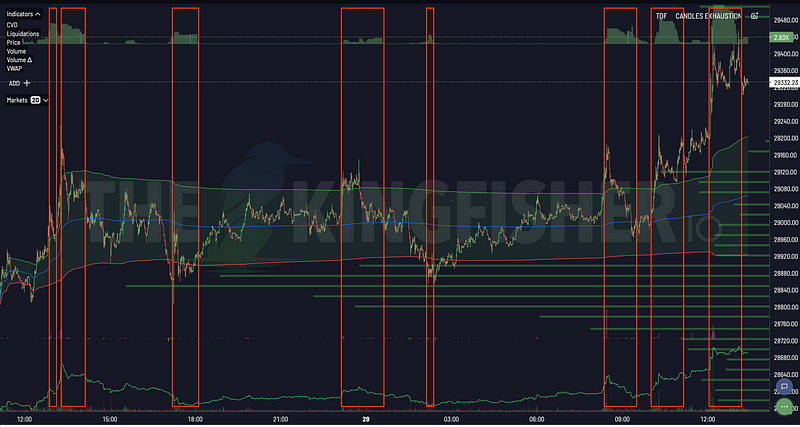
Volume Profile / V-Charts: Each candle represents fixed volume instead of fixed time. High volume periods = many candles. Low volume = few candles. Exhaustion stands out like a sore thumb. We'll come back to this.
Time Frames: Match Your Style
| Time Frame | Best For | Typical Hold |
|---|---|---|
| 1-min | Scalping | Minutes |
| 5-min / 15-min | Day trading | Hours |
| 1-hour / 4-hour | Swing trading | Days |
| Daily | Position trading | Weeks |
| Monthly | Trend direction | Months |
Rule of thumb: Use higher timeframes for direction, lower timeframes for entry timing. Never trade against the daily trend on a 5-minute setup unless you have a very specific reason (like a massive cluster providing clear risk/reward).
Candlestick Patterns That Actually Matter
Single Candles
Doji -- Tiny body, wicks on both sides. Open ≈ Close. Meaning: Indecision. Nobody won this battle. Often precedes a reversal or a breakout -- context determines which.
Hammer -- Small body at top, long lower wick. Found at bottoms. Meaning: Sellers pushed down hard, buyers absorbed everything and rejected the low. Potential reversal signal -- but ONLY after a downtrend. A hammer in the middle of a range is just noise.
Shooting Star -- Small body at bottom, long upper wick. Hammer's evil twin. Found at tops. Buyers pushed up, sellers rejected. Potential bearish reversal.
Engulfing -- Large body completely swallows the previous candle's body. Bullish engulfing (green eats red) = buying pressure overwhelmed sellers. Bearish engulfing (red eats green) = opposite. Stronger signal when it happens at key levels (which we'll define properly in a minute).
Multi-Candle Patterns
Morning Star -- Big red candle, small indecision candle, big green candle. Bottom of downtrend. The transition from selling exhaustion to buying conviction. Classic reversal pattern.
Evening Star -- Inverse of morning star. Top of uptrend. Green → indecision → red. Distribution starting.
Three White Soldiers -- Three consecutive large green candles, each closing higher than the last. Clean bullish momentum. No upper wicks = buyers in complete control.
Three Black Crows -- Three consecutive large red candles, each closing lower. Sellers dominating. Get out of the way or short into it.
Key point: Patterns mean nothing in isolation. A morning star forming at a major long liquidation cluster? That's confluence -- pattern + data confirming the same thing. A morning star forming in the middle of thin air with no clusters, no OI confirmation, no volume? Probably noise.
Support and Resistance: The Traditional vs. The Real
What Your Textbook Taught You
"Support is a price level where buying pressure exceeds selling pressure. Resistance is where selling pressure exceeds buying pressure."
Cool. But HOW do you identify these levels?
Traditional approach:
- Previous highs/lows become S/R
- Round numbers ($50k, $100k for $BTC)
- Moving averages (50 MA, 200 MA)
- Trendlines connecting swing points
Problem: These are all historical. They tell you where price reacted before. They don't tell you whether anyone actually CARES about those levels right now.
What the LiqMap Tells You (The Real S/R)
Long liquidation cluster at $49,800 ($500M):
This isn't "maybe support because price bounced here 3 weeks ago." This is $500 million of leveraged long positions that will be force-sold if price drops to $49,800. That selling pressure is REAL. It's quantified. It's sitting there waiting to trigger if price gets close enough.
Short liquidation cluster at $52,200 ($300M):
Same logic inverted. $300M of shorts that must buy to cover if price reaches $52,200. That buying pressure is guaranteed if price gets there -- shorts don't have a choice.
This is why LiqMap levels are stronger support/resistance than almost anything else on your chart:
- They represent CURRENT positions (not historical bounces)
- They have DOLLAR VALUES attached (not subjective "looks strong")
- They create self-fulfilling prophecies (price magnetizes toward clusters)
- They update in real-time as positions open and close
When traditional S/R aligns with a LiqMap cluster? That's your highest-confidence level. Trade it. When they disagree? Trust the cluster. The cluster has real money behind it. Your trendline is a line you drew on a screen.
Volume: The Fuel Gauge
Reading Volume Correctly
High volume + Price up = Strong buying commitment. The move is fueled by real money entering, not just short covering. Trend likely continues.
High volume + Price down = Strong selling commitment. Real distribution happening. Not just profit-taking.
Low volume + Price up = Weak rally. No conviction. Easy to reverse. Watch out.
Low volume + Price down = Weak selling. Absorption likely. Potential bounce if buyers step in.
Volume divergence = Warning sign. Price makes new high but volume makes lower high? The move is running out of fuel. Smart money is distributing while price still rises. Classic distribution pattern.
Volume + Clusters
When price approaches a liquidation cluster and volume spikes? That's the cascade starting. Positions getting liquidated creates more volume which triggers more liquidations. Feedback loop.
When price approaches a cluster and volume DRIES UP? That's absorption. Someone is taking the other side of every trade without moving price. Smart money accumulating against the crowd. Reversal loading.
Kingfisher's CVD (Cumulative Volume Delta) tool shows you exactly this -- whether aggressive flow is matching price movement or diverging from it. More on that in the CVD guide.
Key Indicators: Which Ones Actually Help
RSI (Relative Strength Index)
Scale: 0-100.
- Overbought (>70): Price extended to upside. Caution on new longs.
- Oversold (<30): Price extended to downside. Caution on new shorts.
- Divergence: Price makes higher high, RSI makes lower high = momentum fading. Reversal candidate.
RSI is most useful combined with funding rate. RSI overbought AND funding extremely positive? Longs are euphoric AND overextended. Short candidate. RSI oversold AND funding deeply negative? Shorts are crowded AND price stretched. Long candidate.
Kingfisher's RSI Heatmap shows RSI across multiple timeframes and assets at a glance. No need to click through 50 charts.
MACD (Moving Average Convergence Divergence)
Components:
- MACD Line = 12 EMA - 26 EMA
- Signal Line = 9 EMA of MACD
- Histogram = MACD - Signal (shows momentum acceleration/deceleration)
MACD crossover (MACD crosses above signal) = Bullish momentum shift. Good for confirming trend direction, terrible for timing entries by itself. Use it with cluster levels for entry precision.
Moving Averages
50 MA / 200 MA -- The ones everyone watches. Golden cross (50 above 200) = widely followed bullish signal. Death cross (50 below 200) = bearish.
In crypto, MAs get hunted. Everyone puts stops at obvious MA levels. Market makers know this. The LiqMap will often show clusters parked right at major MA levels. Don't treat MAs as magic lines -- treat them as areas where something interesting might happen, then check the data.
Chart Patterns Worth Knowing
Reversal Patterns (Trend Ending Signals)
Head and Shoulders: Three peaks -- left shoulder, higher head, right shoulder (lower than head). Neckline is the breakdown level. Classic top formation. Volume should decline left shoulder → head → right shoulder (diminishing conviction).
Inverse Head and Shoulders: Same thing flipped. Bottom formation. Right shoulder = last flush of weak hands before reversal.
Double Top / Double Bottom: Price tests same level twice and fails. Clear rejection. Stronger when second test has lower volume (exhaustion).
Key question for every reversal pattern: Is there a liquidation cluster nearby that could fuel the reversal? If a double bottom forms right above a massive long cluster, the bounce off that cluster provides the fuel for the reversal. Pattern + data = tradeable setup.
Continuation Patterns (Trend Pausing Signals)
Bull Flag: Sharp upward move (flagpole), then tight consolidation (flag) at slight downward angle. Breakout of flag = continuation of prior trend. Enter on the breakout or the retest of flag resistance.
Bear Flag: Same thing inverted. Down move, consolidation up, continuation down.
Cup and Handle: Rounded bottom (cup) forming over weeks, then small pullback (handle). Classic accumulation pattern before major moves. The handle is often the last shakeout before the real move begins.
Putting It Together: The Reading Process
Step 1: Top-Down Timeframe Analysis
Start wide, zoom in:
- Weekly chart -- What's the macro trend? Bullish, bearish, range?
- Daily chart -- Where are we within that trend? Extended or mid-range?
- 4H / 1H -- Entry timing. Where's the nearest cluster? Where's my stop?
You don't trade the 15-minute chart in isolation. You use it to time an entry that makes sense on the daily and weekly timeframe.
Step 2: Identify Key Levels (With Data)
Mark every level on your chart:
- Traditional S/R (previous highs/lows, round numbers, MAs)
- LiqMap clusters (the real levels with dollar values attached)
- GEX+ flip zones (where dealer positioning changes)
- OI extreme levels (where leverage concentration is dangerous)
Color-code them: Red for danger (levels below current price for longs), green for targets (clusters above). Now you have a roadmap, not a guess.
Step 3: Confirm With Volume
Every level you plan to trade needs volume confirmation:
- Is there volume AT the level (meaning participants care)?
- Is volume trending in the direction you expect?
- Any divergence between price and volume?
No volume at your key level? It might not hold. Find a level where volume confirms interest.
Step 4: Execute With Rules
Entry, stop-loss, take-profit -- all defined BEFORE you enter. Stop placed beyond the nearest cluster (not at some random "support" level). Target at the next major cluster or GEX+ zone.
If any piece of this process is unclear or missing -- wait. The setup will either clarify itself or disappear. Either outcome is fine. Forcing trades into uncertainty is how accounts shrink.
Common Chart-Reading Mistakes
Mistake 1: Pattern-Hunting Everywhere
Not every three-candle formation is a morning star. Not every double-top is a distribution pattern. In ranging markets, patterns form and fail constantly. Only trade patterns that occur at meaningful levels (clusters, GEX+ zones, extreme OI/funding readings).
Mistake 2: Ignoring Volume Completely
"I saw a beautiful head and shoulders pattern!" Cool. Was volume declining into the right shoulder? If volume was INCREASING into the supposed "reversal" pattern, it's not a reversal -- it's accumulation for the next leg up. Volume tells you whether the pattern means what the shape suggests.
Mistake 3: Drawing Too Many Lines
Five trendlines, eight S/R levels, three Fibonacci retracements, Bollinger Bands, Ichimoku clouds... At some point you can't see the chart anymore. You see your own mess.
Maximum effective indicators: 3-5. Master a few. Ignore the rest. Clarity beats complexity every time.
FAQ
Q: How long does it take to become proficient at reading crypto charts? A: Expect 2-3 months of consistent daily practice (30-60 min/day) before chart patterns become second nature. The basics (support/resistance, trend lines, candlestick patterns) click in 3-4 weeks. The hard part -- knowing WHICH patterns matter in context vs which are noise -- takes months of screen time and journaling your reads against actual outcomes. Most beginners can identify patterns after week 2 but only get good at filtering signal from noise after 50+ trades logged.
Q: Which timeframe should I start with when learning to read charts? A: Start with the 4-hour and daily timeframes. They filter out most noise while still giving you actionable setups multiple times per week. 1-minute charts look exciting but they're mostly randomness that will teach you bad habits. Once you're consistently profitable on 4H/daily over 2-3 months, drop down to 1H for entries. Scalping on sub-15m timeframes should come last, not first.
Q: Do I really need Kingfisher data if I'm already good at reading charts? A: Being "good at charts" means you're as informed as every other retail trader using the same public price data. Kingfisher's LiqMap shows where $billions in liquidations are clustered -- information that doesn't exist on any price chart. GEX+ reveals dealer positioning that options pricing implies but no chart displays. TOF shows order flow aggression before it prints as a candle. If you're profitable trading pure charts, adding structural data is the difference between 55% win rate and 60%+ win rate. That 5% gap is what separates hobbyists from professionals.
Q: What's the single most important thing new chart readers get wrong? A: Drawing too many lines and trying to make every level "significant." A chart with 15 support levels has zero support levels because you'll rationalize any price action as "testing one of my levels." Limit yourself to 2-3 key levels per timeframe, derived from volume clusters or structural data (LiqMap zones), not from wherever you feel like drawing a line. Quality of levels beats quantity every time.
Q: Should I learn technical analysis fundamentals before using Kingfisher tools? A: Yes, but don't wait until you're an expert. Spend 2-3 weeks learning basic chart reading (trends, support/resistance, volume basics), then immediately layer in LiqMap data. The combination accelerates both skills -- you'll understand WHAT you're seeing on charts faster when you know WHERE the liquidity actually sits. Pure chart reading without structural data is like driving with one eye open. Functional, but why limit yourself?
Bottom Line
Chart reading is a skill, not a gift. Anyone can learn the patterns. The difference between profitable chart readers and everyone else is what they layer ON TOP of the basics:
- LiqMap clusters instead of guessed support/resistance
- OI trends instead of assumed trend strength
- GEX+ positioning instead of guessing what institutions are doing
- ToF readings instead of wondering if a move is manipulated
- Funding rates instead of assuming sentiment from price alone
Learn the fundamentals. Then graduate to data-driven analysis. Your future PnL will show the difference.
Free Account -- Start Reading Charts With Real Data — Explore Kingfisher Features
Related Articles
Transform Your Crypto Strategy
Harness The Power of The Kingfisher's Comprehensive Market Intelligence!
Glossary
Learn key terms and concepts from our comprehensive crypto trading glossary.
Browse Glossary →Related Articles

Getting Started on The Kingfisher: Stop Being Exit Liquidity
What problem does Kingfisher solve? See how liquidation maps reveal where price will go BEFORE it moves there. Stop getting hunted by whales. Start trading with an edge in 10 minutes.
Toxic Order Flow Bitcoin: Detect Market Manipulation in Real-Time
Stop being exit liquidity. Learn how toxic order flow (TOF) reveals when whales are hunting retail traders. Practical guide with step-by-step interpretation and trading strategies.
How to Detect Crypto Market Manipulation in Real-Time
Stop being played by whales. Learn to spot crypto manipulation before it costs you money using Kingfisher's Toxic Order Flow and liquidation data. Real examples included.

Options Skew Templates for Perp Traders: Complete Guide to Using Skew Data on Kingfisher
Master options skew data for perpetual futures trading. Learn how to read and use Skew templates on Kingfisher, understand different template types (Basic, Vanilla, Premium), when each template works best, and how to combine skew analysis with LiqMap confirmation for high-probability crypto trading setups.